US Immigration

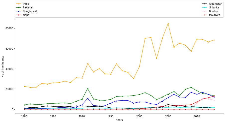
In this blog, I am going to read data about the no of migrants in the US from all around the globe from 1980 to 2013 taken from esa.un.org and loaded in python. I am filtering data from given data and only using data of SAARC countries(Afganistan, Bangladesh, Bhutan, India, Maldives, Nepal, Pakistan, Srilanka). In this program, I am using matplotlib python package to visualize the given data. The data I will use is No of people moved to the US in given Years from their homeland.

SAARC

I have used python to read data and took the data of only 8 SAARC country using function country(C_name). I used matplotlib python package to visualize the extracted data to find out how was the no of migrants to the US from these nations from 1980 to 2013.

 1
 2
 3
 4
 5
 6
 7
 8
 9
10
11
12
13
14
15
16
17
18
19
20
21
22
23
24
25
26
27
28
29
30
31
32
33
34
35
36
37
38
39
40
41
42
43
44
45
46
47
48
49
50
51
52
53
54
55
56
57
58
59
60
61
62
63
64
65
66
67
68
69
70
71
72
73
74
75
76
77
78
79
80
81
82
83
84
85
86
87
88
89
#Importing packages
import matplotlib.pyplot as plt

#using python to load the csv file
f=open("C:/Users/Diwash/Desktop/United States of Americ.csv","r")
data =f.read()
rows = data.split('\n')
final_data = []
for imi_data in rows:
    imig = imi_data.split(',')
    final_data.append(imig)
    
#function to find the data for required country 
#from the file.using this function we will get no. of  
#immigrants from 1980 to 2013 from that country and 
#will be saved as full_data and return to function caller
def country(C_name):
    final_data = []
    for imi_data in rows:
        imig = imi_data.split(',')
        final_data.append(imig)    
    Country_data = []
    for datum in final_data:
         if C_name in datum:
             Country_data.append(datum)
    Country_data = Country_data[0][9:]
    full_data=[]
    for ndatas in Country_data:
        full_data.append(int(ndatas))
    return (full_data)    


# we are getting the years 1980 to 2013 and appending in variable which is list
years_data =final_data[0][9:]
year = []
for years in years_data:
    year.append(int(years))
       
#calling the function for country data and saving in their respective name
nepal=country(C_name="Nepal")
india=country(C_name="India")
afgan=country(C_name="Afghanistan")
pak=country(C_name="Pakistan")
bangladesh=country(C_name="Bangladesh")
butan=country(C_name="Bhutan")
srilanka=country(C_name="Sri Lanka")
maldives=country(C_name="Maldives")

#increasing the size of chart
plt.figure(figsize=(15, 7))
#Below code will make the chart of the given data where
#x-axis will be years and y axis will be no of immigrants
ax = plt.subplot(111) 
plt.xlabel("Years")
plt.ylabel("No of immigrants")   
ax.spines["top"].set_visible(False)      
ax.spines["right"].set_visible(False)    
plt.plot(year,india,c="orange",marker=".",label="India")
plt.legend(bbox_to_anchor=(0., 1.02, 1., .102), loc=3,ncol=2, 
mode="expand", borderaxespad=0.)

plt.plot(year,pak,c="green",marker=".",label="Pakistan")
plt.legend(bbox_to_anchor=(0., 1.02, 1., .102), loc=3,ncol=2, 
mode="expand", borderaxespad=0.)

plt.plot(year,bangladesh,c="blue",marker=".",label="Bangladesh")
plt.legend(bbox_to_anchor=(0., 1.02, 1., .102), loc=3,ncol=2,
mode="expand", borderaxespad=0.)

plt.plot(year,nepal,c="red",marker=".",label="Nepal")
plt.legend(bbox_to_anchor=(0., 1.02, 1., .102), loc=3,ncol=2, 
mode="expand", borderaxespad=0.)

plt.plot(year,afgan,c="black",marker=".",label="Afganistan")
plt.legend(bbox_to_anchor=(0., 1.02, 1., .102), loc=3,ncol=2,
mode="expand", borderaxespad=0.)

plt.plot(year,srilanka,c="cyan",marker=".",label="Srilanka")
plt.legend(bbox_to_anchor=(0., 1.02, 1., .102), loc=3,ncol=2, 
mode="expand", borderaxespad=0.)

plt.plot(year,butan,c="pink",marker=".",label="Bhutan")
plt.legend(bbox_to_anchor=(0., 1.02, 1., .102), loc=3,ncol=2, 
mode="expand", borderaxespad=0.)

plt.plot(year,maldives,c="brown",marker=".",label="Maldives")
plt.legend(bbox_to_anchor=(0., 1.02, 1., .102), loc=3,ncol=2,
mode="expand", borderaxespad=0.)
plt.show()

SAARC

According to the US data:

  • Total Immigrants to US up to 2013 were: 30536689
  • Total Immigrants to US from SAARC from 1980 to 2013 were: 2348624

Nepal

 1
 2
 3
 4
 5
 6
 7
 8
 9
10
plt.figure(figsize=(15, 7))
ax = plt.subplot(111) 
plt.xlabel("Years")
plt.ylabel("No of immigrants")   
ax.spines["top"].set_visible(False)      
ax.spines["right"].set_visible(False) 
plt.suptitle("Nepal data")
plt.scatter(year,nepal,s=nepal,c="red")
plt.plot(year,nepal,c="black",marker='o')
plt.show()

Nepal

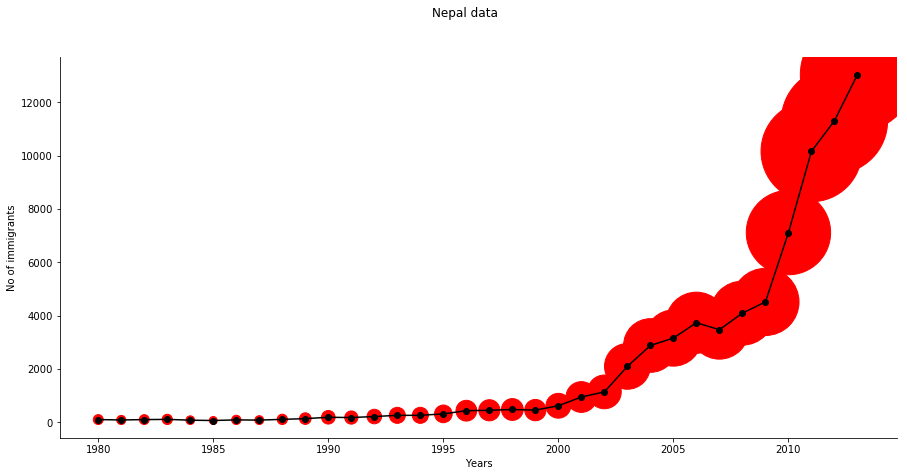
  • Total Immigrants to US from Nepal from 1980 to 2013 were: 72408
  • Percentage of US immigration from Nepal: 0.2371%

India

 1
 2
 3
 4
 5
 6
 7
 8
 9
10
plt.figure(figsize=(15, 7))
ax = plt.subplot(111) 
plt.xlabel("Years")
plt.ylabel("No of immigrants")   
ax.spines["top"].set_visible(False)      
ax.spines["right"].set_visible(False) 
plt.suptitle("India's Data")
plt.scatter(year,india,s=india,c="orange")
plt.plot(year,india,c="white",marker='.')
plt.show()

India

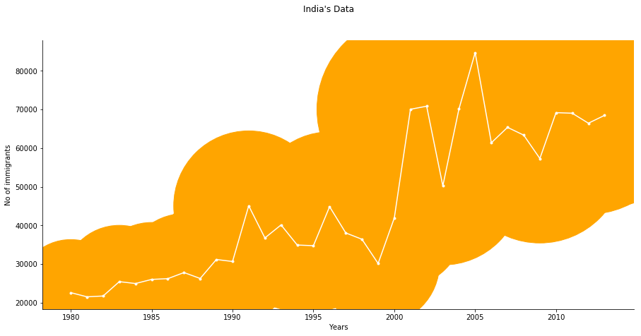
  • Total Immigrants to US from India from 1980 to 2013 were: 1533776
  • Percentage of US immigration from India: 5.0227%

Pakistan

 1
 2
 3
 4
 5
 6
 7
 8
 9
10
plt.figure(figsize=(15, 7))
ax = plt.subplot(111) 
plt.xlabel("Years")
plt.ylabel("No of immigrants")   
ax.spines["top"].set_visible(False)      
ax.spines["right"].set_visible(False) 
plt.suptitle("Pakistan Data")
plt.scatter(year,pak,s=pak,c="green")
plt.plot(year,pak,c="black",marker='*')
plt.show()

Pakistan

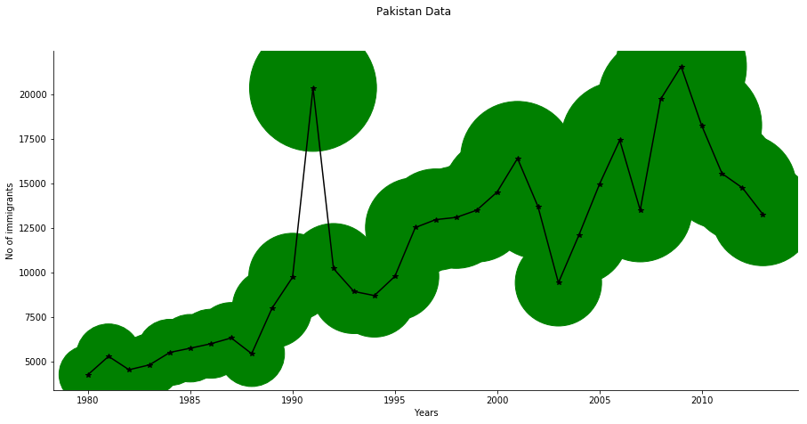
  • Total Immigrants to US from pakistan from 1980 to 2013 were: 390637
  • Percentage of US immigration from Pakistan: 1.2792%

Bangladesh

 1
 2
 3
 4
 5
 6
 7
 8
 9
10
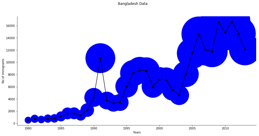
plt.figure(figsize=(15, 7))
ax = plt.subplot(111) 
plt.xlabel("Years")
plt.ylabel("No of immigrants")   
ax.spines["top"].set_visible(False)      
ax.spines["right"].set_visible(False) 
plt.suptitle("Bangladesh Data")
plt.scatter(year,bangladesh,s=bangladesh,c="blue")
plt.plot(year,bangladesh,c="black",marker='o')
plt.show()

Bangladesh

  • Total Immigrants to US from Bangladesh from 1980 to 2013 were: 231946
  • Percentage of US immigration from Bangladesh: 0.7596%

Srilanka

 1
 2
 3
 4
 5
 6
 7
 8
 9
10
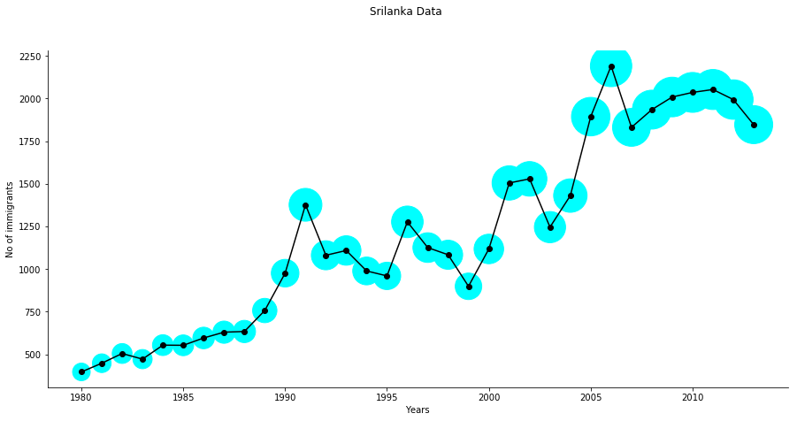
plt.figure(figsize=(15, 7))
ax = plt.subplot(111) 
plt.xlabel("Years")
plt.ylabel("No of immigrants")   
ax.spines["top"].set_visible(False)      
ax.spines["right"].set_visible(False) 
plt.suptitle("Srilanka Data")
plt.scatter(year,srilanka,s=srilanka,c="cyan")
plt.plot(year,srilanka,c="black",marker='o')
plt.show()

Srilanka

  • Total Immigrants to US from Srilanka from 1980 to 2013 were: 41403
  • Percentage of US immigration from Srilanka: 0.1356 %

Afganistan

 1
 2
 3
 4
 5
 6
 7
 8
 9
10
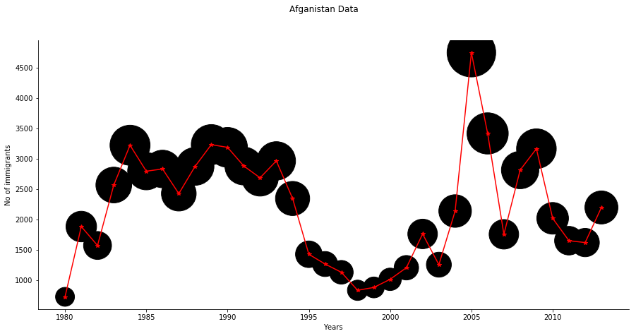
plt.figure(figsize=(15, 7))
ax = plt.subplot(111) 
plt.xlabel("Years")
plt.ylabel("No of immigrants")   
ax.spines["top"].set_visible(False)      
ax.spines["right"].set_visible(False) 
plt.suptitle("Afganistan Data")
plt.scatter(year,afgan,s=afgan,c="black")
plt.plot(year,afgan,c="red",marker='*')
plt.show()

Afganistan

  • Total Immigrants to US from Afganistan from 1980 to 2013 were: 74430
  • Percentage of US immigration from Afghanistan: 0.2437%

Bhutan

 1
 2
 3
 4
 5
 6
 7
 8
 9
10
11
12
13
14
15
16
17
18
19
20
21
22
23
24
25
26
27
28
29
30
31
32
33
34
35
36
37
38
39
40
41
42
43
44
45
46
47
48
49
50
51
52
53
54
55
56
57
58
59
60
61
62
63
64
65
66
67
plt.figure(figsize=(15, 7))
ax = plt.subplot(111) 
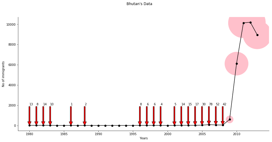
# below annotate code show us the value or
#it is shown to show the data are not zero as it seem 
#in graph other remaining near to zero are zero
ax.annotate('13', xy=(1980,13), xytext=(1980, 2000),
arrowprops=dict(facecolor='red', shrink=0.005))

ax.annotate('8', xy=(1981,8), xytext=(1981, 2000),
arrowprops=dict(facecolor='red', shrink=0.005))

ax.annotate('14', xy=(1982,14), xytext=(1982, 2000),
arrowprops=dict(facecolor='red', shrink=0.005))

ax.annotate('10', xy=(1983,10), xytext=(1983, 2000),
arrowprops=dict(facecolor='red', shrink=0.005))

ax.annotate('1', xy=(1986,1), xytext=(1986, 2000),
arrowprops=dict(facecolor='red', shrink=0.005))

ax.annotate('2', xy=(1988,2), xytext=(1988, 2000),
arrowprops=dict(facecolor='red', shrink=0.005))

ax.annotate('8', xy=(1996,8), xytext=(1996, 2000),
arrowprops=dict(facecolor='red', shrink=0.005))

ax.annotate('6', xy=(1997,6), xytext=(1997, 2000),
arrowprops=dict(facecolor='red', shrink=0.005))

ax.annotate('6', xy=(1998,6), xytext=(1998, 2000),
arrowprops=dict(facecolor='red', shrink=0.005))

ax.annotate('4', xy=(1999,4), xytext=(1999, 2000),
arrowprops=dict(facecolor='red', shrink=0.005))

ax.annotate('5', xy=(2001,5), xytext=(2001, 2000),
arrowprops=dict(facecolor='red', shrink=0.005))

ax.annotate('14', xy=(2002,14), xytext=(2002, 2000),
arrowprops=dict(facecolor='red', shrink=0.005))

ax.annotate('15', xy=(2003,15), xytext=(2003, 2000),
arrowprops=dict(facecolor='red', shrink=0.005))

ax.annotate('17', xy=(2004,17), xytext=(2004, 2000),
arrowprops=dict(facecolor='red', shrink=0.005))

ax.annotate('30', xy=(2005,30), xytext=(2005, 2000),
arrowprops=dict(facecolor='red', shrink=0.005))

ax.annotate('78', xy=(2006,78), xytext=(2006, 2000),
arrowprops=dict(facecolor='red', shrink=0.005))

ax.annotate('52', xy=(2007,52), xytext=(2007, 2000),
arrowprops=dict(facecolor='red', shrink=0.005))

ax.annotate('42', xy=(2008,42), xytext=(2008, 2000),
arrowprops=dict(facecolor='red', shrink=0.005))

plt.xlabel("Years")
plt.ylabel("No of immigrants")   
ax.spines["top"].set_visible(False)      
ax.spines["right"].set_visible(False) 
plt.suptitle("Bhutan's Data")
plt.scatter(year,butan,s=butan,c="pink")
plt.plot(year,butan,c="black",marker='o')
plt.show()

Bhutan

  • Total Immigrants to US from Bhutan from 1980 to 2013 were: 231946
  • Percentage of US immigration from maldives: 0.7595%

Maldives

 1
 2
 3
 4
 5
 6
 7
 8
 9
10
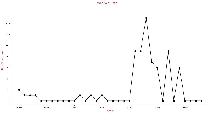
plt.figure(figsize=(15, 7))
ax = plt.subplot(111) 
plt.xlabel("Years",color="brown")
plt.ylabel("No of immigrants",color="brown")   
ax.spines["top"].set_visible(False)      
ax.spines["right"].set_visible(False) 
plt.suptitle("Maldives Data",color="brown")
plt.scatter(year,maldives,s=maldives,c="brown")
plt.plot(year,maldives,c="black",marker='o')
plt.show()

Maldives

  • Total Immigrants to US from Maldives from 1980 to 2013 were: 69
  • Percentage of US immigration from maldives: 0.00025%

This was the analysis of immigration in the US from the SAARC region. Every year lots of people immigrate to the USA for education, prosperity or opportunity to make their American dream come true. SAARC is also one of the main regions where lots of people migrate to the USA.