Population Analysis

Today I am writing about Population though my last two posts were also about population.But, today in this post I will analyse the data and make some visuals using the data and find some answers. In this blog, I am going to use the dataset from the UN databank (Link:http://data.un.org/). This dataset is about the world population from 1950 to 2015. It has the population data of all the Continents, Country. I am using python to read this dataset and have a look in the CSV file. I am using Numpy for analysis or for arithmetic and Matplotlib for visualization of data and Jupyter Notebook as my Python workspace. I am using only the contents of 6 Continents(Note: exclude Antarctica there is no permanent settlement) and population of the world for analysis and following are the code I wrote for it.
|
|
In the following code, I used the function “region” to get the data of continent according to their name by searching in the list called “rows” and another function “Interize” to convert the string value in the list to Integer.
|
|
|
|
|
|
|
|
|
|
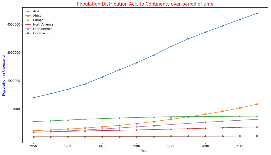
In the above plot, we can see the size of the population of continents from 1950 to 2015 using the legend and graphs plot. This plot is using Year as X-axis and Population in Thousand as Y-axis. We can see all the continent’s population is increasing but Europe’s is starting to decrease from the year 1995. It may seem the population of Oceania region is Zero but not as the population of Australia is very small and this graph is using population in thousand bases so it seems Oceania is zero.
|
|
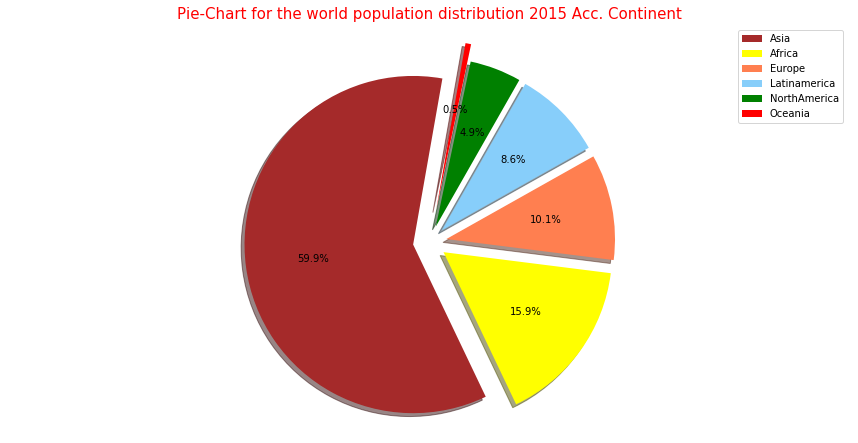
This Pie-Chart shows us the population size of every continent in the year 2015. It shows us the population of “Asia” is more than double combining all the remaining continents. This graph looks like a pizza where Asia has the biggest share of pizza.“Oceania” has only 0.5% of the whole world population.
|
|
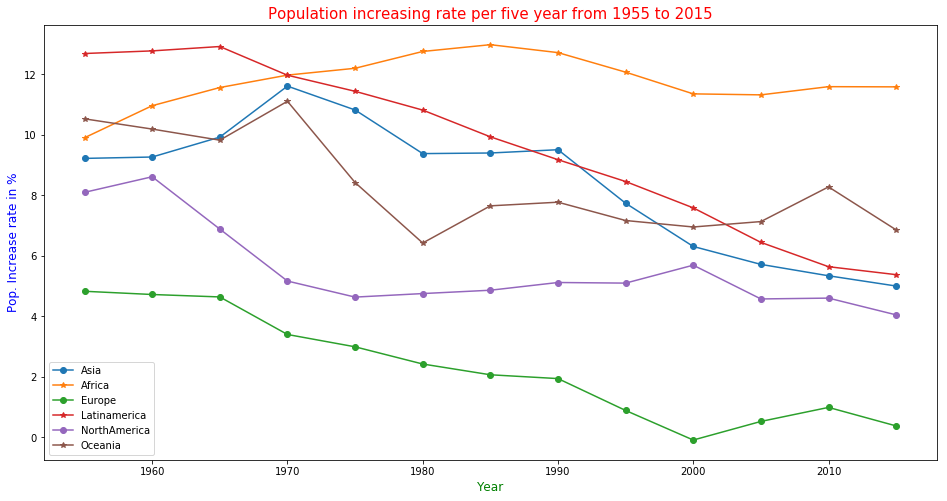
This graph plot is about the population growth rate per five years of continents. The population growth rate in Europe is decreasing over the year slowly. The population increase rate is high for Africa and it will increase Africa’s population. Though Oceania has the Smallest population it has the second highest increasing rate. The high population increase rate of Asia is slowing down it seems the effect of economic boom in some Asian country.
|
|
In the following code, we are plotting a bar diagram with 6 multiple data. In the plt.bar() I used the year as X-axis and to print Six data in that one x-axis point it is needed to move the bar so all 6 bar can be shown. To show all bar I added 0.6 to every bar to print the bar in a new position so it will disturb other bars.
|
|
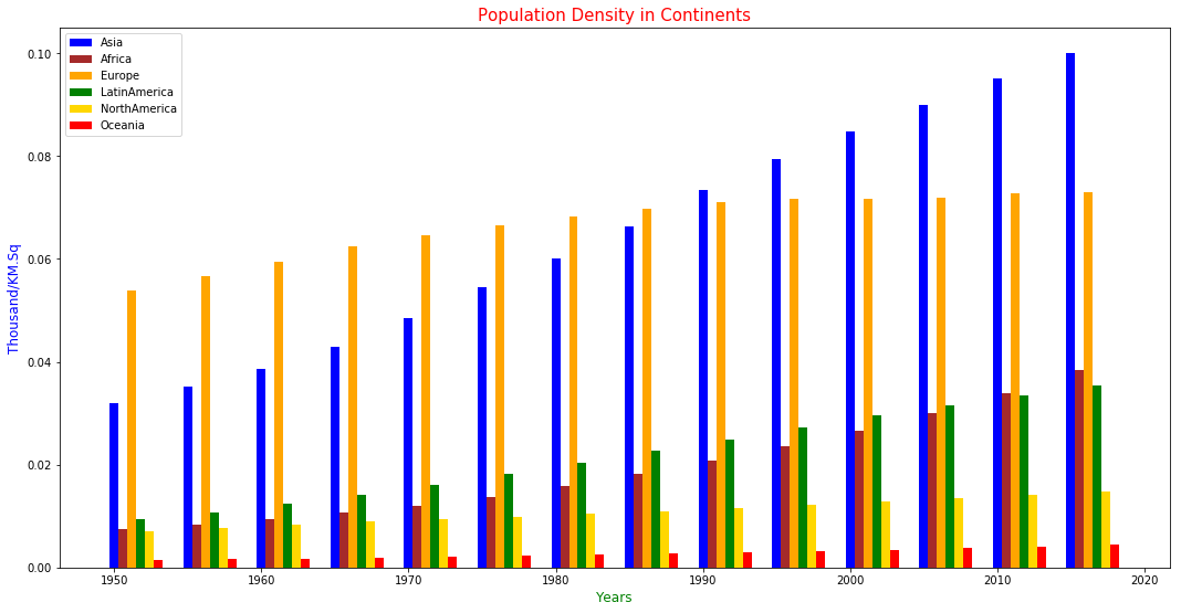
In the above plot, we can see the density of the population over a period of time in Continents. In today’s time, the dense continent is Asia it left Europe behind in 1990 and Europe is 2nd dense continent. Oceania is the least dense country as its land area is big compared to Europe but the population is very small.
|
|
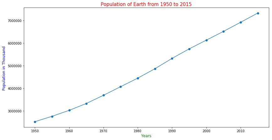
The above plot is about the population of the whole world. The graph shows that the population of the world increased in very high rate over the last 50 years. The population of the world was 2525779 thousand in 1950 and it became more than double i.e 7324782 thousand over a period of 65 years in 2015.
|
|
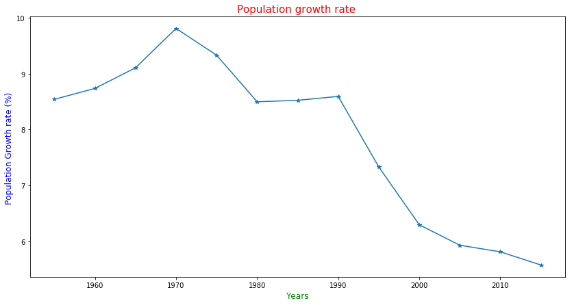 The above plot shows the population Growth rate of the world on the basis of 5 years. This plot shows the Population growth rate from 1955 to 2015. The Growth rate started to decrease from 1970 when the rate was 9.80856% and it is 5.5783% for 2015. Though it seems rate is decreasing but the growth of population is fast as Population is large small growth rate also add a large number of new people to the population.