Interactive Visualization with ggplot2 and Plotly

I love to work with data and while analyzing the data visualization helps a lot to show the result of analysis. In this blog i will show how to create interactive visualization with ggplot2 and plotly package in Rstudio Environment.
GGplot2 is powerfull visualization package based on The grammar of graphics and part of Tidyverse. It is easy to use and powerful to create any type of visualization. The problem is it can only make beautiful static visualization.
Plotly is a free opensource library for interactive visualization. Plotly can convert the high-quality ggplot graphs to interactive graphs. We will use plotly along with ggplot2 to create beautiful interactive visualization.
At First we will create a static visualization with ggplot2 and then make the ggplot graph interactive with plotly package. We will use data about Nobel Prize winner to create the visualization.
Load Packages
lets load the required packages in our R environment.
|
|
Load Data
I am using the Nobel Prize winner data which is sourced from TidyTuesday github which release every week new data project.
|
|
Here is the data that i will use to create visualization.
| prize_year | category | prize |
|---|---|---|
| 1901 | Chemistry | The Nobel Prize in Chemistry 1901 |
| 1901 | Literature | The Nobel Prize in Literature 1901 |
| 1901 | Medicine | The Nobel Prize in Physiology or Medicine 1901 |
| 1901 | Peace | The Nobel Peace Prize 1901 |
| 1901 | Peace | The Nobel Peace Prize 1901 |
| 1901 | Physics | The Nobel Prize in Physics 1901 |
| 6 rows | 1-3 of 18 columns |
Create a barplot
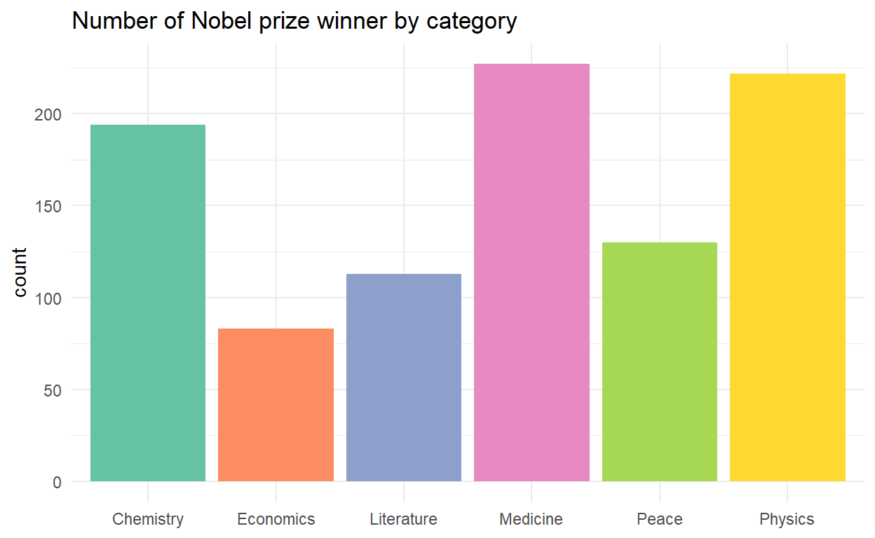
Now we can create bar plot showing the number of the Nobel Prize winner and the prize category. At first we create a static plot with ggplot2 .
|
|

Make ggplot interactive
Here we will pass the ggplot to the ggplotly function from plotly package ,which creates interactive graph.
|
|
I like to keep the plot clean , So I will hide the Modebar of the plotly.
|
|
Save the plot
We can use this interactive plot in website,reports and also share with others . Lets save it locally and we can share the html file.
|
|
Wrapping up
At last we made the ggplot2 charts interactive using a single ggplotly() function.You can find lots of data in Tidytuesday repo for analysis and create great visualization to show the insights.