Data Visualization with ggplot2
We have seen lots of visuals in our life like pictures, animations, and some graphical plots. Graphics help or make easy to get an idea or understand anything. Visualization is an important part of the Data science or Data Analysis. In this blog, we will learn about visualization in R by creating different type of plots.
Lets Visualize
We will use ggplot2 package which follows the grammar of graphics. Its very powerful tool for visualization and very famous in R community.We will use the mpg datasets in ggplot2 package to create the visual graphs.
|
|
From above code, we found out that mpg has 234 rows and 11 columns. We will create different type of visualization using ggplot2 package.
Scatterplot
A scatterplot uses the value of two variables to plot on the graph. A scatterplot shows the correlation between two variables in the graph. In this scatterplot, we used color to define the distribution of data using the third variable.
|
|
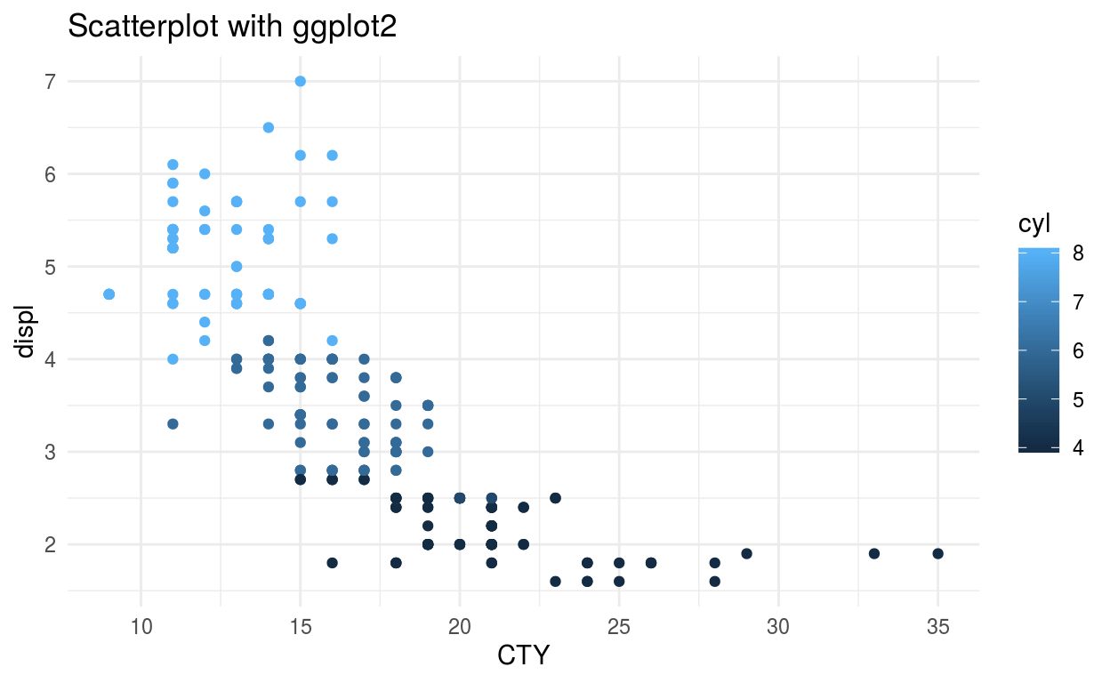
The ggplot() takes data frame input then we can define the required graph type using geom_graphtype(). Here I am using geom_point() to show scatterplot. Then we need to assign the x and y value from the data frame that is going to be used in creating graph. We can assign a title, labels to x-axis and y-axis of the graph using the labs().ggplot2 has multiple themes which are built in and I am using theme_minimal.
Bar Chart
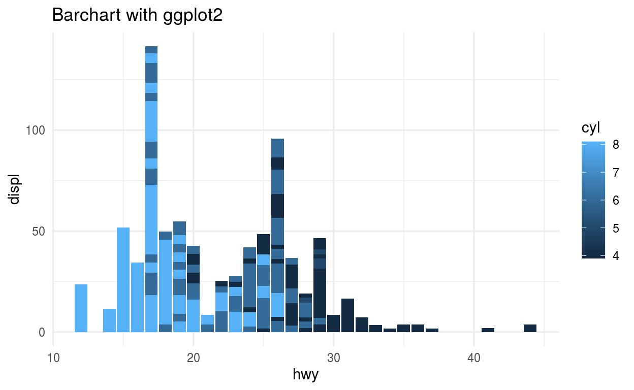
Barchart uses 2 variable to show its plot using rectangular shape. Barchart height shows the sum of y axis data on basis of the x-axis variable.
|
|
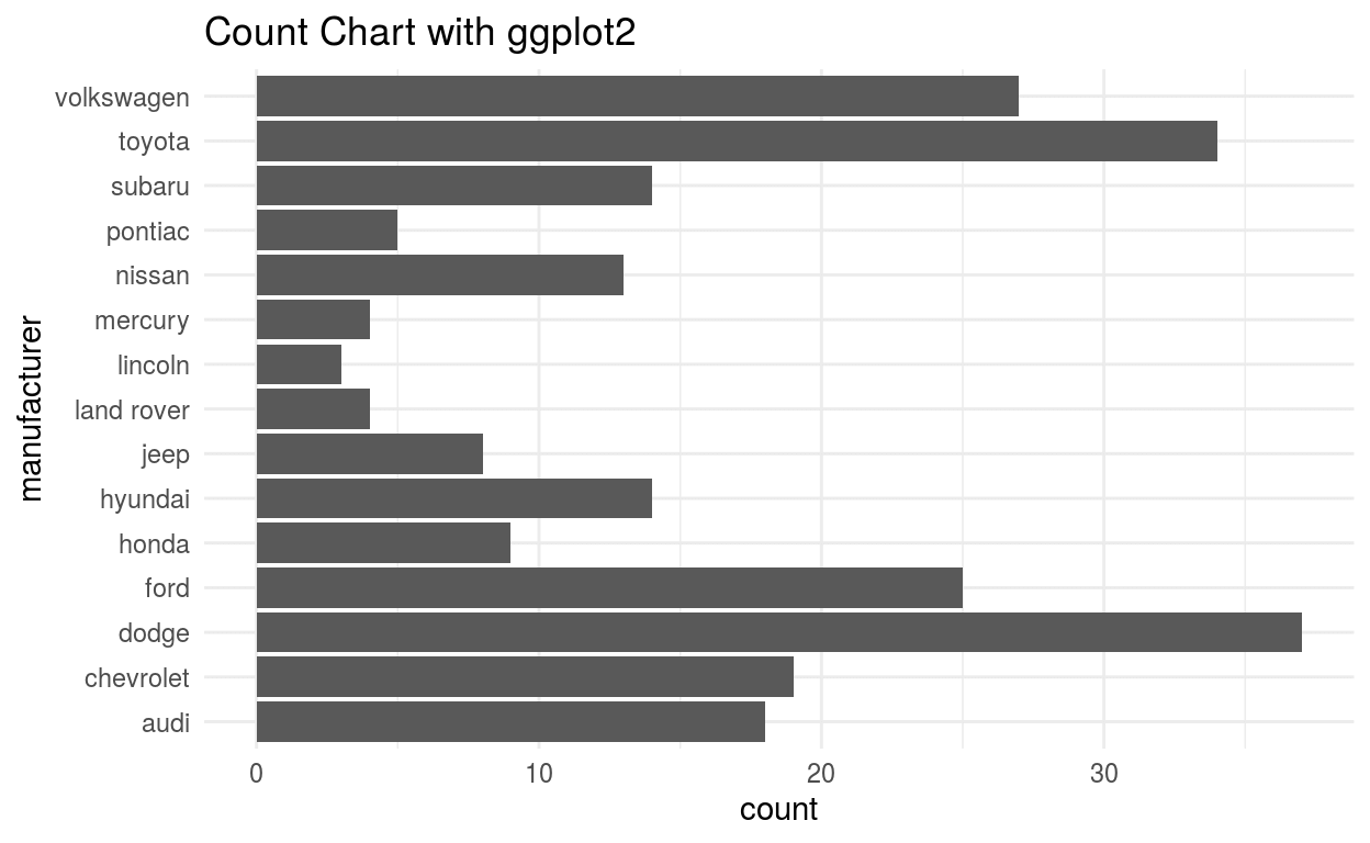
Count Chart
The Count chart uses only one variable and plots the presence count of variable.
|
|
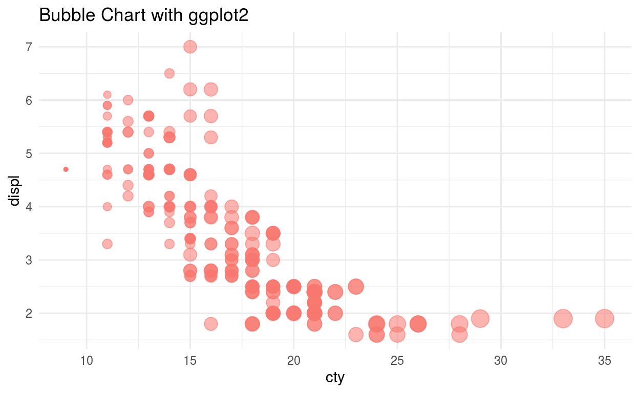
Bubble Chart
The Bubble chart is same as a scatterplot only difference is it uses an extra third variable to show the size of the points.
|
|
Line Chart
The line chart is plot which shows information by connecting series of points with straight lines.In above picture, we can see the line plot.B ut this dataset is not good to plot a time series so we will create a data frame with a random variable and plot another line plot.
|
|
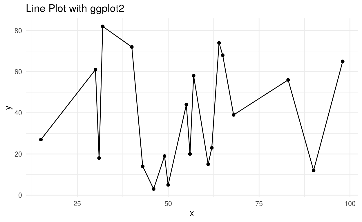
In this line chart, we can see the series of the data points connected by the lines. Time series and finacial analysis use line plots .
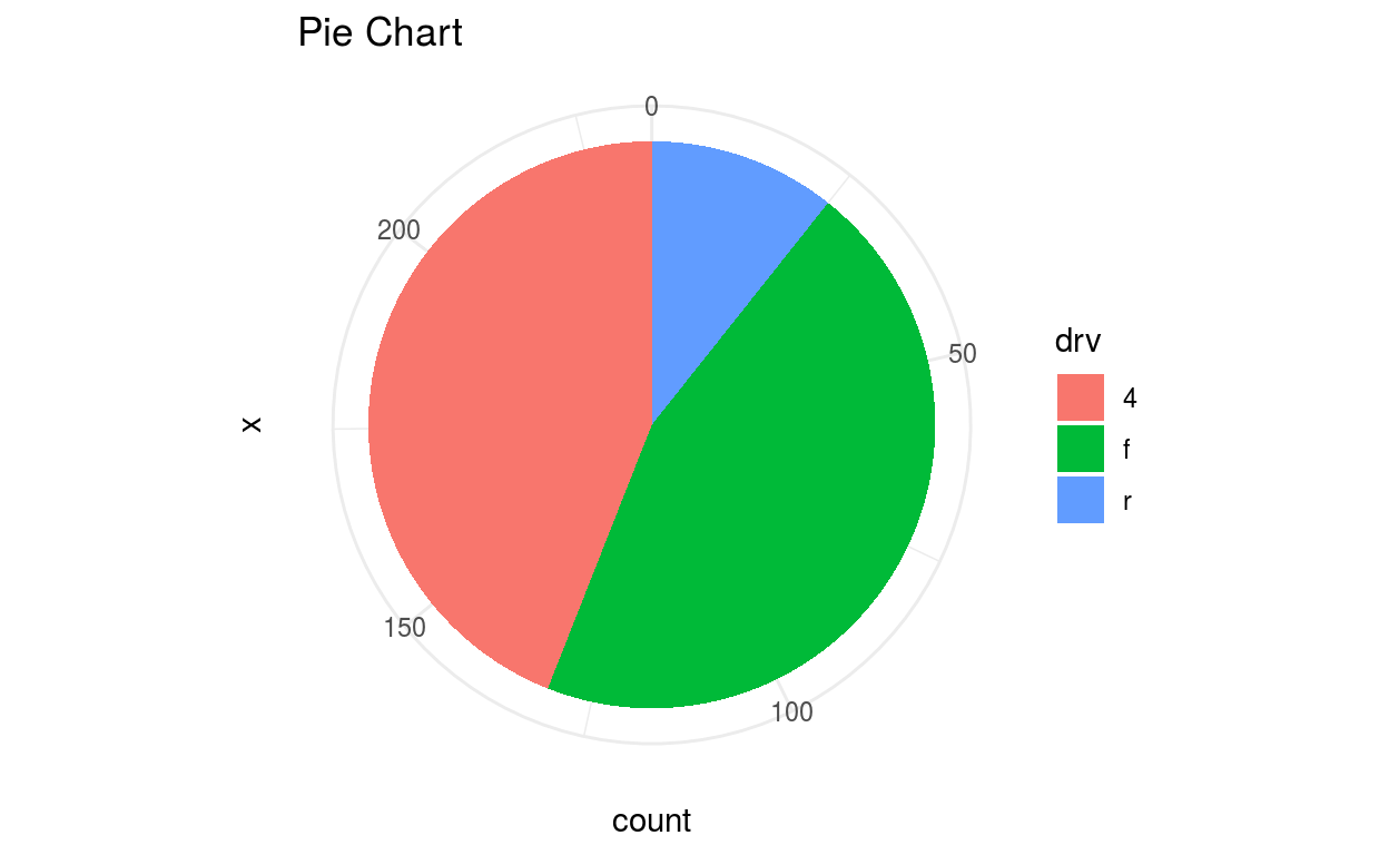
Pie Chart
Piechart got its name as it looks like a pie or round shape. It plots counts of a variable in a circle and it plots to take the whole circle as 100%. A pie chart is not good for multiple variable visualization.
|
|
Histogram
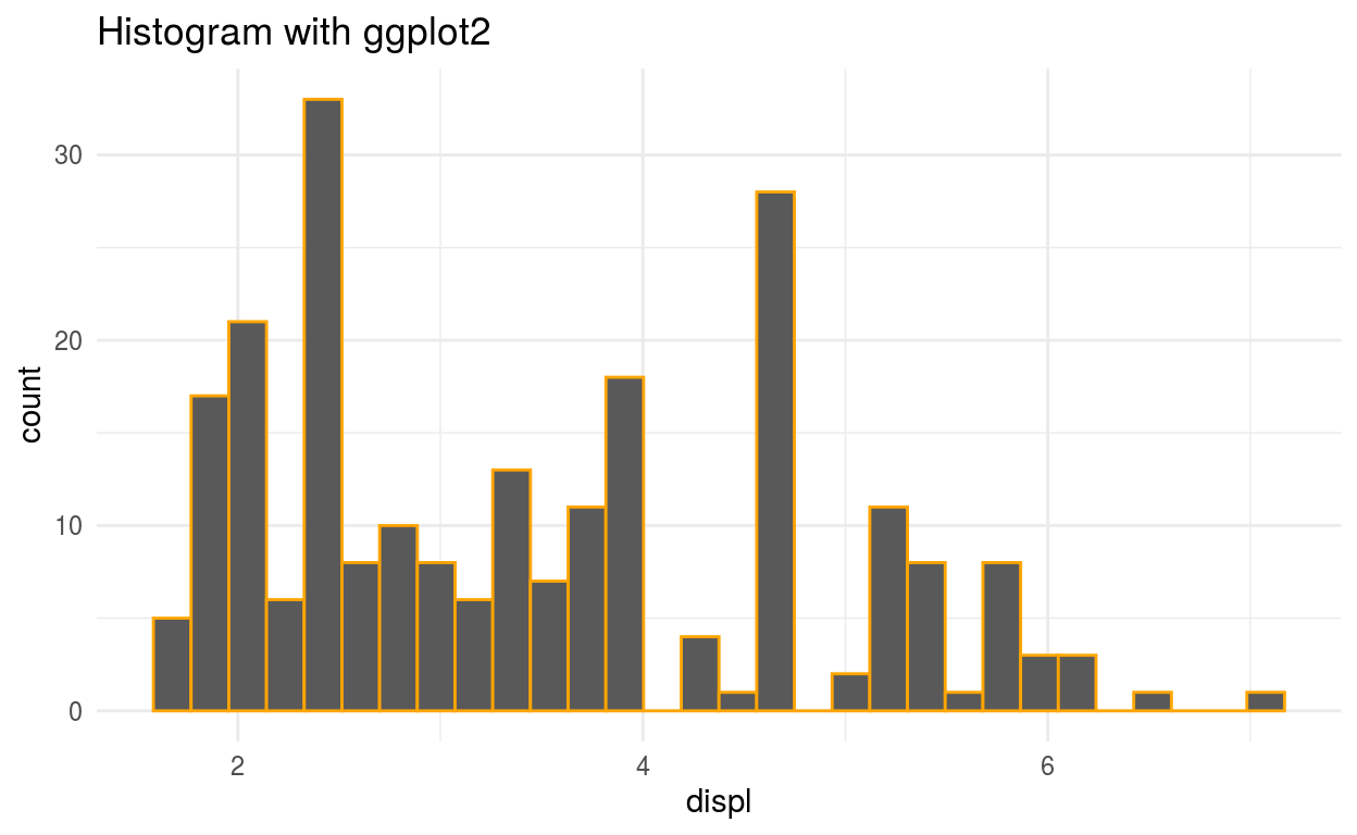
Histogram is a rectangular plot which gives us the frequency of the variable by making different ranges. It shows the distribution of a continuous variable. Histogram is different from the bar chart, bar chart relates to Two variables but histogram relates to One variable. Histogram uses the bin that divides the entire range of values into a series of intervals—and then count how many values fall into each interval.Histogram also shows the distribution of the data.
|
|
Area Plot
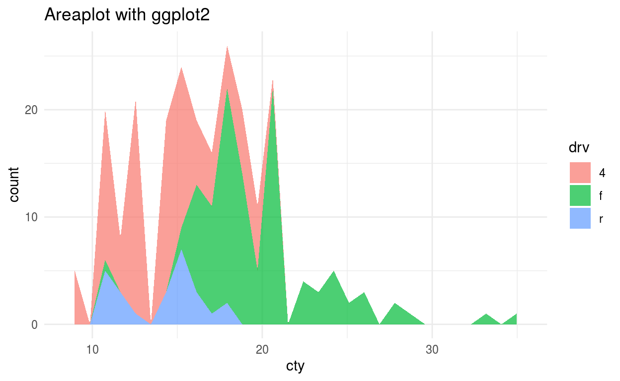
The only difference between Area and line plot is the area plot is filled with color. Combination of two or more area plot form Stacked area plot.
|
|
Box Plot
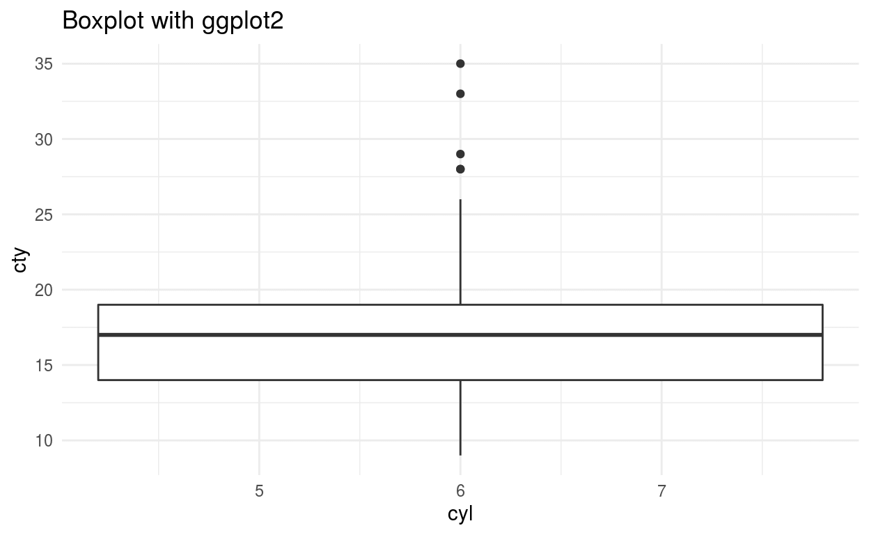
Boxplot plots five number summary in single plot ie minimum, first quartile, median, third quartile, and maximum. The box upper and lower side shows third and the first quartile respectively. Middle line in the box shows the median value. The line above and below the box shows maximum and minimum value and points outside this line are called outliers
|
|
Density Plot
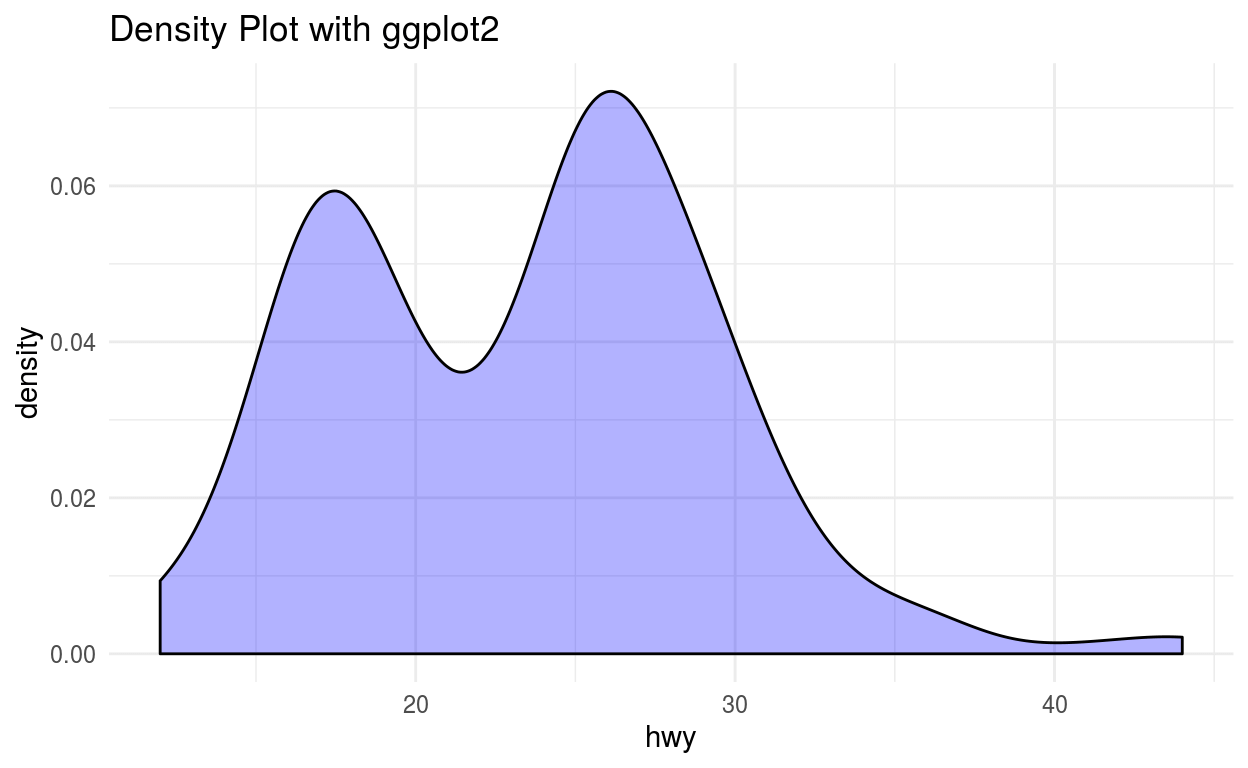
Density plot shows the distribution of the data. This plot shows the smooth distribution by smoothing out the noise. The peaks of Density Plot display where values are concentrated over the interval.
|
|
These are the few of the many visualization types which are used in Data Analysis or Data Science. I hope it this was helpful for you.